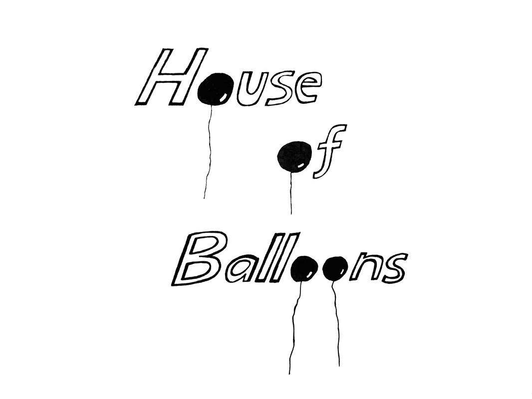
For this free project, I chose to illustrate the title of a song by the Weeknd called "House of Balloons." I wanted to emphasize repetition and include elements that reflected the literal meaning of the title, such as the balloons. Once again, I decided to go with black and white because I thought it achieves the most contrast and resonates well with the themes of the song. The white is almost blinding, which makes the black balloons stand out even more and creates this overwhelming, bright light effect. Even though there isn't much on screen, I feel like the design fills up one's vision. Anymore elements would simply be too much.
The theme of this assignment was repetition, with a must-include element of autumn/fall. I chose this quote on the internet although it's not directly related to the season because I thought it could really paint an image using the letterings. As for repetition, I repeated the vowels with bold letters to emphasize the "au" sounds, inspired by the word "autumn." Also, the words "things fall" and "better things" are in smaller letters than the rest because they are sort of like the nouns or subjects of the phrase. Overall, the mood I wanted to deliver was light, warm, easy, care-free and transient. Moreover, I decided to shoot the design in one of my dried-up plants
For this project we practiced hand-sketching letters using different size, shape and tone to create contrast. I chose to recreate the font used in the cover of Fight Club because it's one of my all time favorite films and part of that reason is because of the font, which attracted me in the first place. The fonts looked almost surreal and superficial, which is why I was grasped by at first sight.
I wanted to render the font so that it looks carved out and shiny. To do that, I included some highlights and shadows to create the illusion of depth and the texture of the surface. I split the phrase into two parts using different colors and shades to emphasize contrast and meaning. But I think I could have achieved that by altering the depths of the letters so that the contrast would be more dramatic and clever. Also, I would try to redo the entire surface of the soap so that it matches the letterings. But overall I felt pretty confident and proud of this piece. I realized that to really get the quality and satisfaction you want in a piece, you have to put in time and patience to really push the art. Otherwise, it just turns up rushed and unfinished. |
AuthorWrite something about yourself. No need to be fancy, just an overview. Archives
February 2016
Categories |