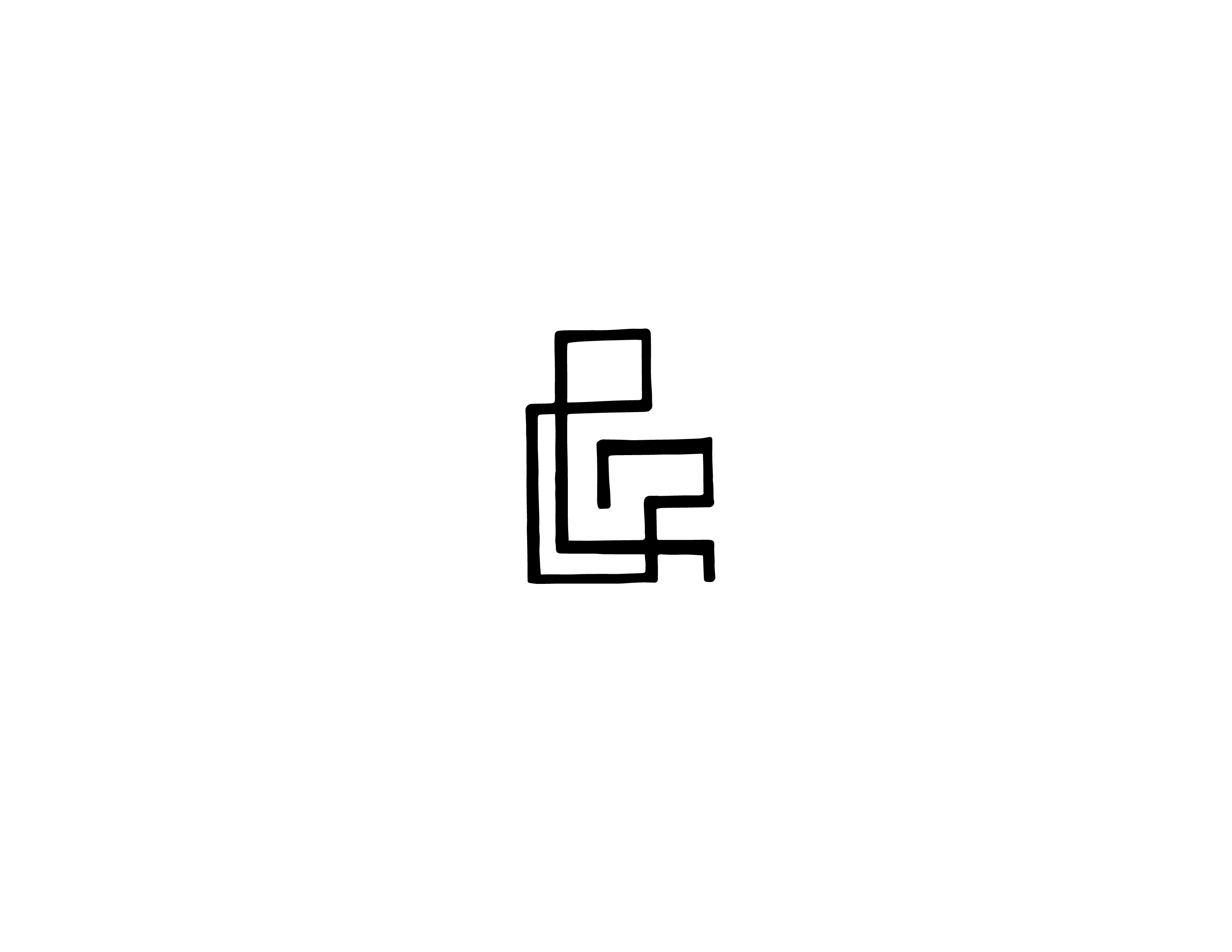
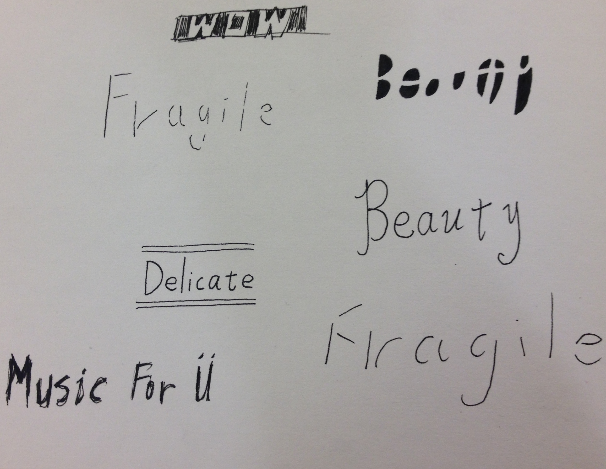
Here is my own interpretation of the ampersand symbol. I chose to transform the original curvy nature of the symbol into a more straight-lined one. And I also added some additional turns just to complete the design. I like this design a lot because it contains this subtle beauty of simplicity and balance of lines that makes it very pleasing to the eye. The weight of the strokes took me a while to find but eventually I settled on one that is just starting to encompass the negative spaces but not quite yet. And the placement and sizing of the symbol on the page is just right. Any bigger of smaller would have marred the designed. I am quite proud of this piece of work and it can hopefully make it into a new family of fonts in the near future.
I thought eat me was a fun phrase that had a double entendre, like both literally and figuratively. And I just happened to find some plastic apples lying around my house so I just painted over one and made this cool little display. If I could redo it, I would probably have put the letters closer together because right now it is hard to fit them all into one, single frame. But the image gets the message across just fine.
Once again, I tackled this assignment with a bit of a minimalist approach. I figured it would be sort of interesting to create a simple narrative instead of just a normal design. The design is spilt nto two segements, one on the front and one on the back of the card. I have designed this character that sort of resemble old man Nicholas and the Grinch, like a hybrid between the two. And I chose some festive colors, mostly warm, to emphasize that it is meant to be a Christmas card. Overall, I believe I did not execute this project as well as I envisioned it in my head. I was hoping for a more clear-cut, rendered look but I was only able to achieve a fairly rough one. But this serves well as it gave me the opportunity to try out this bold attempt at creating a design that has a narrative, while using a minimalist style of approach.
Headlines
-Should we be worried? -The Golden Age of Emoji -Are you eating right? -The Human Issue -Faded -Intoxicated -The Legend of [ ] -Popping pills -Anonymity For this free project, I chose to illustrate the title of a song by the Weeknd called "House of Balloons." I wanted to emphasize repetition and include elements that reflected the literal meaning of the title, such as the balloons. Once again, I decided to go with black and white because I thought it achieves the most contrast and resonates well with the themes of the song. The white is almost blinding, which makes the black balloons stand out even more and creates this overwhelming, bright light effect. Even though there isn't much on screen, I feel like the design fills up one's vision. Anymore elements would simply be too much.
The theme of this assignment was repetition, with a must-include element of autumn/fall. I chose this quote on the internet although it's not directly related to the season because I thought it could really paint an image using the letterings. As for repetition, I repeated the vowels with bold letters to emphasize the "au" sounds, inspired by the word "autumn." Also, the words "things fall" and "better things" are in smaller letters than the rest because they are sort of like the nouns or subjects of the phrase. Overall, the mood I wanted to deliver was light, warm, easy, care-free and transient. Moreover, I decided to shoot the design in one of my dried-up plants
For this project we practiced hand-sketching letters using different size, shape and tone to create contrast. I chose to recreate the font used in the cover of Fight Club because it's one of my all time favorite films and part of that reason is because of the font, which attracted me in the first place. The fonts looked almost surreal and superficial, which is why I was grasped by at first sight.
I wanted to render the font so that it looks carved out and shiny. To do that, I included some highlights and shadows to create the illusion of depth and the texture of the surface. I split the phrase into two parts using different colors and shades to emphasize contrast and meaning. But I think I could have achieved that by altering the depths of the letters so that the contrast would be more dramatic and clever. Also, I would try to redo the entire surface of the soap so that it matches the letterings. But overall I felt pretty confident and proud of this piece. I realized that to really get the quality and satisfaction you want in a piece, you have to put in time and patience to really push the art. Otherwise, it just turns up rushed and unfinished. In class I experimented with a range of mediums in creating letters while listening to music done by various artists. Persoanlly I found the sharpie and the fine liner to be my tool of choice because they simply gave cleaner lines and had a nice touch of serenity to them.
|
AuthorWrite something about yourself. No need to be fancy, just an overview. Archives
February 2016
Categories |